


Let’s Discuss to Build Something Great Together!
At Aron Web Solutions, we don't adapt desktop designs for mobile — we build for mobile from the ground up. Our team combines user research, strategic thinking, and precise execution to create experiences that feel effortless on every screen. We obsess over the details that matter most to your users — fast load times, intuitive navigation, clean layouts, and seamless interactions. With a proven track record across industries, we deliver mobile-first designs that don't just look great — they perform, convert, and scale with your business.


Your users are already on mobile. The question is whether your product is ready for them. A desktop design squeezed into a small screen creates friction — slow loads, broken layouts, tiny tap targets, and navigation that frustrates instead of guides. That friction doesn't just lose a click. It loses trust. Mobile-first design isn't about shrinking things down — it's about making deliberate decisions for the environment where attention is shortest, thumbs do the work, and patience runs out in seconds. Get that right, and every other screen becomes easier.


We study how users interact with your platform on mobile devices to identify friction points plus usability gaps.

We structure layouts around mobile navigation, touch interactions, plus content prioritization before desktop adaptation begins.

We create scalable designs that maintain consistency, usability, plus performance across multiple screen sizes.

We continuously refine interfaces through usability testing, performance analysis, plus device compatibility validation.
Smart solutions tailored to fit your goals and budget
Custom CRM systems that streamline customer management, automate processes, and improve sales and operational visibility.


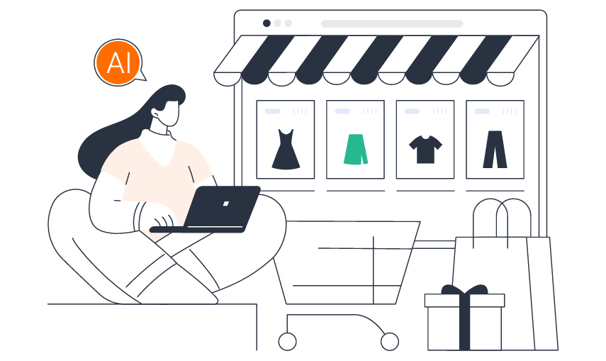
Custom AI-powered solutions designed to automate workflows, improve decision-making, and accelerate business growth through intelligent technologies.


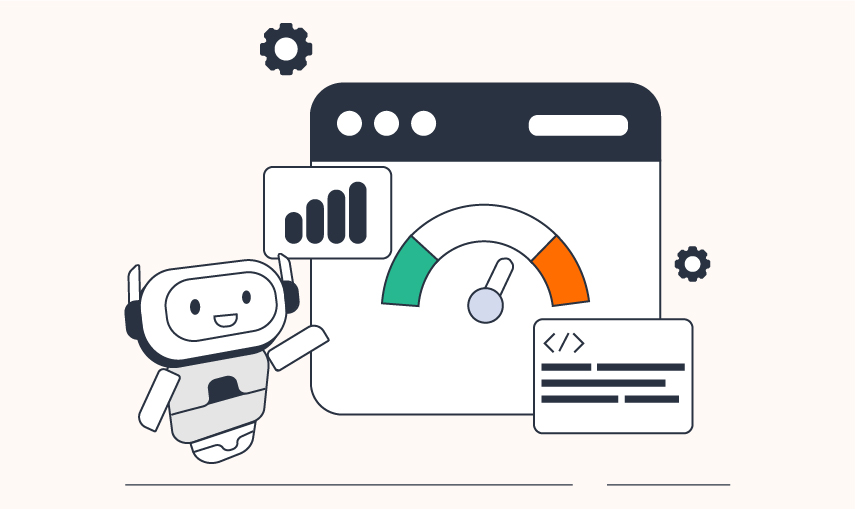
Scalable, secure, and high-performance websites built to support business operations, user experience, and long-term growth.


.png)

Modern, conversion-focused website designs built to improve user engagement, strengthen branding, and increase conversions.


Data-driven digital marketing strategies focused on increasing visibility, generating qualified leads, and driving measurable ROI.


Complete business package to generate leads, convert prospects, and retain customers, without the chaos of managing multiple vendors


Mobile-first design means we start the design process with the smallest screen, your mobile layout, and build outward from there. Instead of shrinking a desktop design to fit a phone, we make deliberate decisions for mobile first, then scale up for tablets and desktops.
Most of your users are already on mobile. If your experience isn't built for that environment, slow to load, hard to navigate, cluttered on small screens — you're losing users before they even engage. Mobile-first design directly impacts bounce rates, conversions, and how Google ranks your site.
They work together but aren't the same thing. Responsive design means your layout adapts across screen sizes. Mobile-first means we design the mobile experience first and let it inform everything else. One is a technical approach, the other is a design philosophy — we practice both.
Absolutely. Mobile-first doesn't mean desktop-last. It means every layout decision is made with purpose — starting from the tightest constraints and expanding thoughtfully so your product looks and performs well on every device.
Timelines depend on the scope — a single landing page moves faster than a full product or ecommerce platform. After an initial discovery call, we give you a clear timeline based on your specific requirements, not a generic estimate.
Yes. Aron Web Solutions covers the full design-to-development workflow. We don't hand off a file and disappear — we stay involved through implementation to make sure the final product matches the design intent on every screen.
We work across industries — ecommerce, SaaS, hospitality, healthcare, professional services, and more. Mobile user behavior varies by industry, and we tailor our approach based on how your specific audience interacts with your product.
Yes. We can redesign your existing website with a mobile-first strategy, improving usability, performance, and conversion rates on smartphones while ensuring a seamless experience across tablets and desktops.


F 177, 4th Floor, Phase 8b,
Sector 74, Mohali (Punjab) India.


© Copyright 2026 Aron Web Solutions


